load("cosmos-processed.RData")

# again just looking at Wytham Woods here
wwoods <- subset(all_sites, SITE_NAME=="Wytham Woods")

library(mgcv)
Loading required package: nlmeThis is mgcv 1.9-0. For overview type 'help("mgcv-package")'.David L Miller
In this practical exercise we’ll look at making predictions using the models we’ve fitted so far. We will then show how to calculate variance for predictions from these models.
We’ll first load the data, subset it and load mgcv…
(If you don’t have the data, you can download it from here.)
Let’s fit the same model as we did in the previous exercise:
We want to make predictions from this model. We can think of this as taking the model equation:
\mathbb{E}(\texttt{COSMOS\_VWC}) = \beta_0 + s(\texttt{ndate})
and setting \beta_0 and the coefficients of s() to their estimated values, then plugging-in values of ndate. So, to make the prediction we need values of ndate to plug-in…
To set-up the grid is easy when we only have one covariate. We can simply use seq() to make a sequence of values, then put them in a data.frame:
We could extrapolate by replacing the max and min values with values further in the future/past, of course, but we won’t do that here.
With the grid setup, we just need to invoke the predict() function with both our fitted model and our grid:
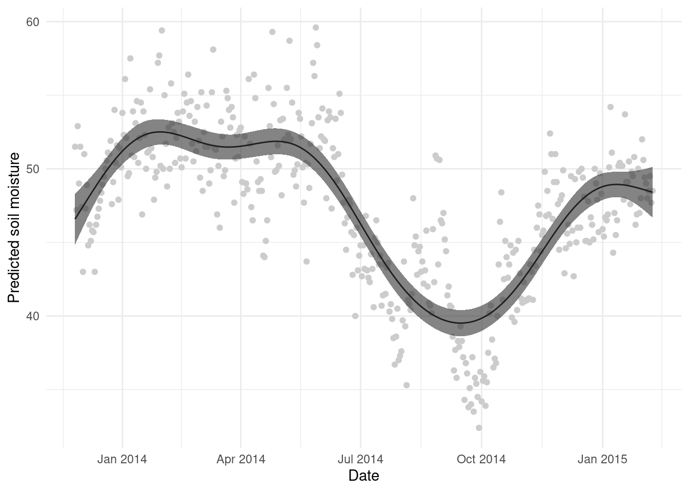
Note that here I’ve added the predictions as another column in the grid data.frame so that it is easier to plot. And let’s see that plot:
We can clean this up a bit, plot the original data and ggplot2ify it:
predict() extrasAs noted in the slides, we can use different options to get different output from predict(). One argument that is particularly useful is type=. This changes the kind of prediction to one of the following:
"response" to put on the response scale"iterms" to give per term predictions"lpmatrix" for a prediction matrixThe type="response" is, of course, most useful when dealing with non-Normal data, when a link function is used (e.g., when modelling counts).
Generally, when we make a prediction, it’s important to also have an idea of the uncertainty attached to that prediction. This is very simple within predict(), as we can simply provide the se.fit=TRUE option and this will give us the standard error for each prediction.
We’ll predict the values for gr again but assign to a new variable so we can examine the output:
List of 2
 $ fit   : num [1:200(1d)] 46.6 46.9 47.2 47.5 47.8 ...
  ..- attr(*, "dimnames")=List of 1
  .. ..$ : chr [1:200] "1" "2" "3" "4" ...
 $ se.fit: num [1:200(1d)] 0.863 0.805 0.749 0.696 0.645 ...
  ..- attr(*, "dimnames")=List of 1
  .. ..$ : chr [1:200] "1" "2" "3" "4" ...
We can see the two list elements, one $fit has the same values as we found for gr$p above, and the other $se.fit has the corresponding standard error values.
A simple plot of the mean \pm 2 standard errors can be helpful (and is what is in the plot() output), so we build that here:
# create the upper and lower intervals
gr$upper <- gr$p + 2*pred_se$se.fit
gr$lower <- gr$p - 2*pred_se$se.fit

# make the plot
ggplot(gr, aes(x=date, y=p)) +
  geom_point(aes(x=DATE_TIME, y=COSMOS_VWC), data=wwoods, colour="grey80") +
  geom_line() +
  geom_ribbon(aes(ymin=lower, ymax=upper), alpha=0.6) +
  theme_minimal() +
  labs(x="Date", y="Predicted soil moisture")